Website usablity test of doordash.com (mobile version)
This is a supplemental usability test to a previous study I did of the web app Doordash. The purpose of this test was to measure the functionality and ease of use in ordering food to be delivered from the mobile version of the site. I tested 3 new users in this study.
User Info
-
User 1
- Occupation: Epidemiologist
- Hours per week browsing the web: 20hrs
- Types of sites browsed: News, Science, Sports
- Favorite websites The New Yorker, ESPN, The Atlantic
-
User 2
- Occupation: Sales Representative
- Hours per week browsing the web: 15hrs
- Types of sites browsed: Gaming, Extreme Sports
- Favorite websites Kotaku, Eveningsends
-
User 3
- Occupation: Health Care Administrator
- Hours per week browsing the web: 30hrs
- Types of sites browsed: Pop Culture, Video Streaming
- Favorite websites Instagram, Netflix
Script
The script I used (below) was meant to prompt these three users to navigate and utilize basic features of the doordash.com mobile web app and to study their frustrations while fulfilling these tasks.
Intro
I would like to remind you that this is not a test – there are no wrong answers. We’re conducting this test to see how functional the website is, not to test you as an individual.
Initial Questions
"OK. Before we look at the site, I’d like to ask you just a few quick questions. First, what’s your occupation? What do you do all day? Roughly how many hours a week altogether—just a rough estimate— would you say you spend using the Internet, including Web browsing and email, at work and at home? What kinds of sites (work and personal) are you looking at when you browse the Web? Do you have any favorite websites?"
Tasks
You're ordering McDonald's breakfast to be delivered to your house. In this order you would like to include items exclusive to the breakfast menu. Add two or three breakfast items to your cart – how would you set this order up?
You want to schedule this delivery to arrive on Saturday May 9th @ 9:00 am. How would you schedule that?
You decide that you no slonger need one of the items in your cart. How do you remove it from your order?Download PDF version of usability test script here
Thoughts after the testing
Once again, I was able to indicate two major issues in the usability of doordash.com. During my usability tests of the mobile site I found that all three users stumbled while attempting the tasks that were confusing to me in my initial review of the desktop version of the website – illustrating the point that some features needed to be redesigned to enhance usability on both the mobile and desktop platforms.
1. How does the user find the appropriate menu they want to order from, e.g., breakfast, lunch, dinner?
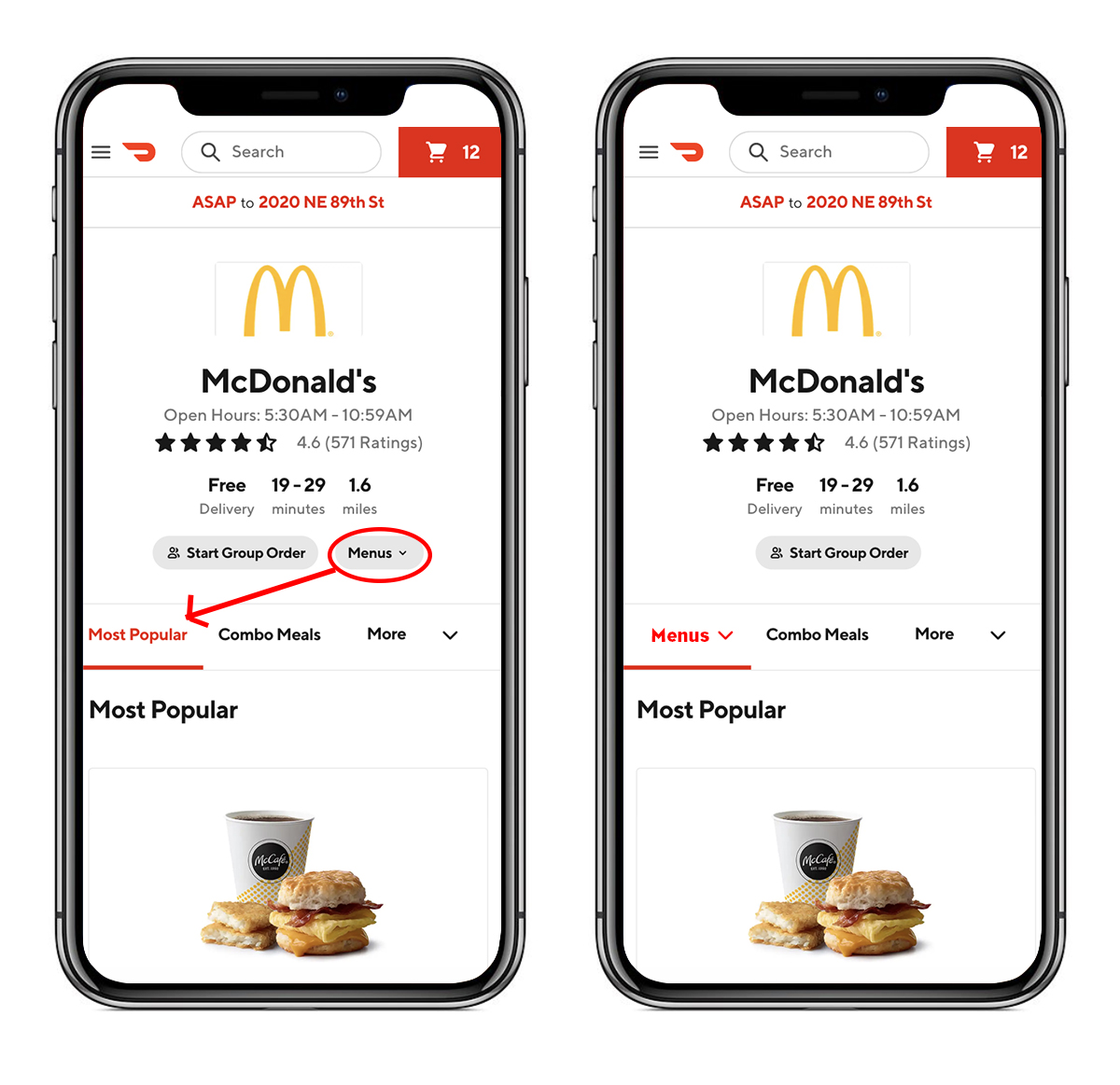
In the tasks I prompted the users with, I asked them to order from a menu that was not available at the time they were ordering it – in this case it was McDonald’s breakfast to be delivered at a future date and time (May 9th, 9:00 a.m.). Two of three users in this study scrolled up and down the listing of options on the McDonald’s page for approx. 2-3 mins looking for breakfast items and searching in the secondary navigation only to find that the options were being populated by lunch items. It wasn’t until the 3 - 4 minute mark that these users noticed the "grayed out" button placed above the page’s secondary navigation that reads “menus” with a dropdown arrow and allows the user to select which menu they would like to order from (including breakfast).
My assumption was that the users would be able to locate the menus button on the mobile version with less frustration than the desktop. I thought that the smaller screen and having fewer visual distractions would allow them to locate the “menus” button with more ease, but that turned out to be false. For two of the three users that I tested it took them several minutes to find the "menus" button. This is of course an improvement on the desktop test where three of three users were unable to find this button in a reasonable amount of time. Two of three is still a cause for concern, so I would suggest making the same adjustments on the web version of the site as I suggested for the desktop version.
How would I fix this?
- I would add the “menus” dropdown button to the secondary nav as the first button. It’s the first place two of the three users I tested looked and I think it would make sense to consolidate this menu here.
- As an alternative I would keep the menus button where it is, but make the background color the brand red instead of light gray, which would help visibility.

2. How does the user set up an order for a future delivery date?
Similar to the first prompt I thought this task would be simpler on a mobile device due to the smaller screen size and consolidation of the U/I. However, once again my theory was incorrect and this task proved to be confusing to the users. Though only two of three users stumbled while trying to achieve the task written in the instructions, I would make a suggestion to alter the design in a similar fashion to the proposal I made for the desktop version of the site, since two of three is technically the majority.
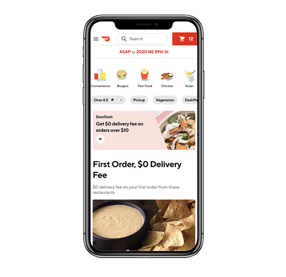
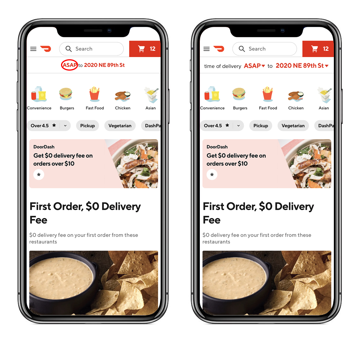
The key issue is that the delivery time and date auto-populates with “ASAP.” On the mobile web app this button has a sufficient amount of whitespace and visibility, however there isn’t enough context for the meaning of “ASAP” in that location and the styling does not visually imply that it’s a button.
How could this feature be improved?
- Although I understand the thinking in making the default delivery date and time “ASAP” when considering the purpose of this app (to have food delivered quickly to fill an immediate desire) I think they should add a dropdown arrow to the button ASAP to make the user more aware that this is a button that has a dropdown feature which is not currently apparent. I also think it would be more clear if they added the phrase “time of delivery” before “ASAP” to give it context.

Conclusion
The results surprised me when I concluded these mobile tests. After going through the tasks on my own a few days before, I assumed a lot of things – mostly that there would be fewer issues with the user experience on a mobile device. Needless to say I was wrong. The tasks that proved difficult to users on the desktop version of the site were similarly complicated on the mobile version, which (to me) illustrated that although desktop and mobile devices can produce unique user experience issues, bad U/X design is confusing regardless of the device.