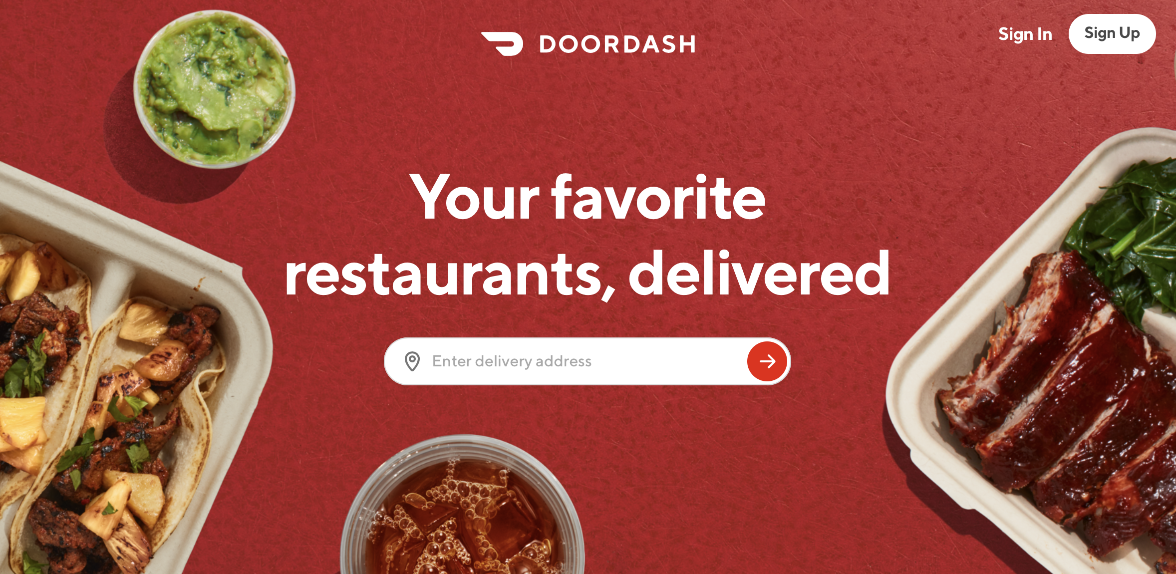
Website usablity test of Doordash.com (desktop version)
I conducted a usability test of the web app doordash.com. The purpose of this test was to measure the functionality and ease of use in ordering food to be delivered from the desktop version of the site. I tested 3 users in this study.
User Info
-
User 1
- Occupation: Director of office administration and scheduling
- Hours per week browsing the web: 30hrs
- Types of sites browsed: News, e-commerce, encyclopedia, and cooking
- Favorite websites New York Times, Washington Post, Amazon Prime Video
-
User 2
- Occupation: Small business owner
- Hours per week browsing the web: 12hrs
- Types of sites browsed: Sports, mapping, and gaming
- Favorite websites ESPN, Seattle Times, Google Maps
-
User 3
- Occupation: Middle school teacher
- Hours per week browsing the web: 25hrs
- Types of sites browsed: News, music, sports
- Favorite websites Seattle Times, Rotten Tomatoes, Youtube
Script
The script I used (below) was meant to prompt these three users to navigate and utilize basic features of this web app and to study their frustrations while fulfilling these tasks.
Initial Questions
"OK. Before we look at the site, I’d like to ask you just a few quick questions. First, what’s your occupation? What do you do all day? Roughly how many hours a week altogether—just a rough estimate— would you say you spend using the Internet, including Web browsing and email, at work and at home? What kinds of sites (work and personal) are you looking at when you browse the Web? Do you have any favorite websites?"
Tasks
"You're ordering McDonald's breakfast to be delivered for your family. In this order you would like to include: 4 Egg McMuffins, 4 hash browns, 1 large strawberry Banana smoothie, 1 medium mango pineapple smoothie, and 2 large coffees. How would you set this order up? You want to schedule this delivery to arrive on Saturday May 2nd @ 9:00 am. How would you schedule that?"
"You want to schedule this delivery to arrive on Saturday May 2nd @ 9:00 am. How would you schedule that?"
"You decide that you no longer need the mango pineapple smoothie. How do you remove it from your order?"Download PDF version of usability test script here
Thoughts after the testing
I was able to indicate two major issues in the usability of doordash.com. During my usability tests I found that all three users stumbled while attempting the tasks that were confusing to me in my initial review of the website – illustrating the point that some features needed to be redesigned to enhance usability.
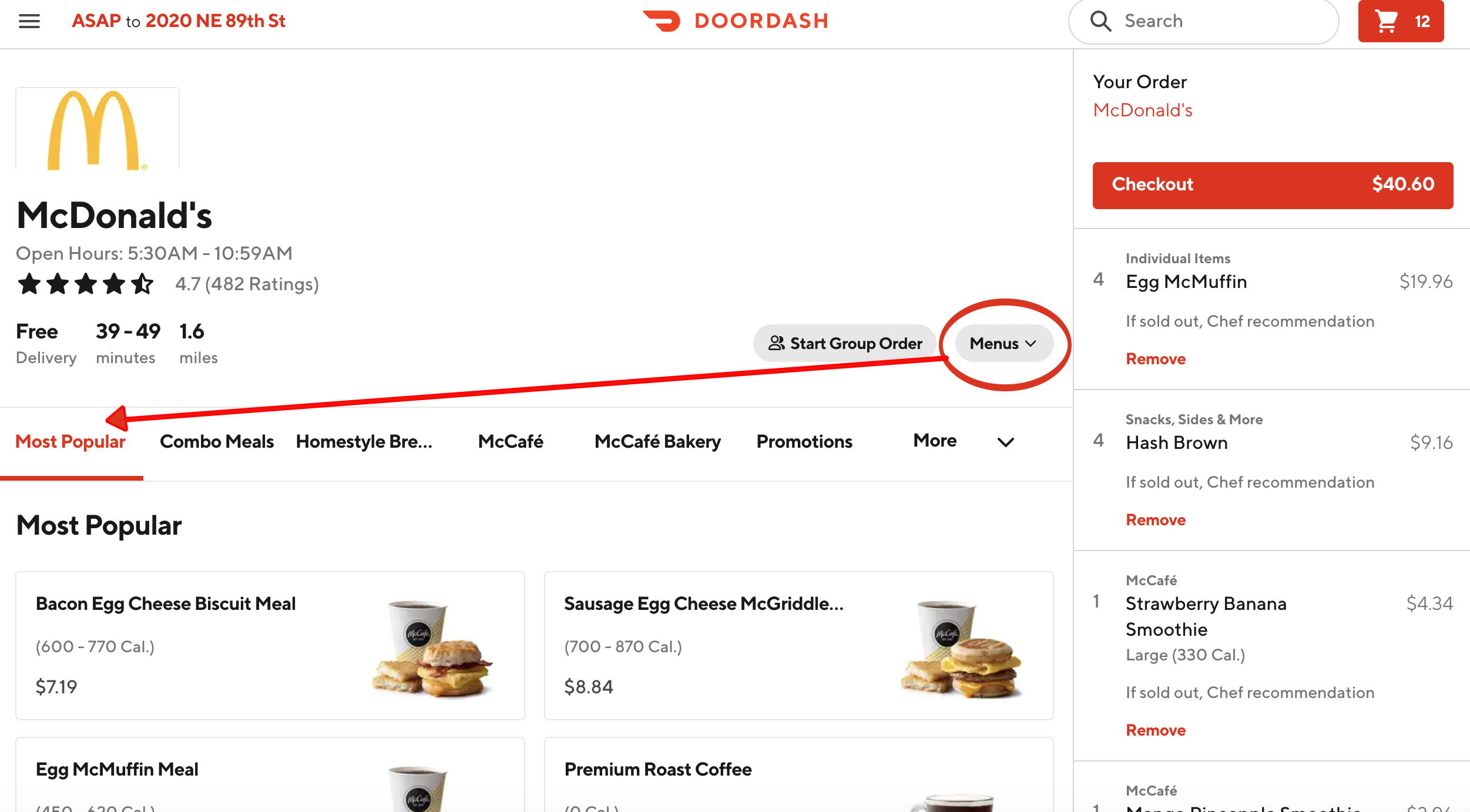
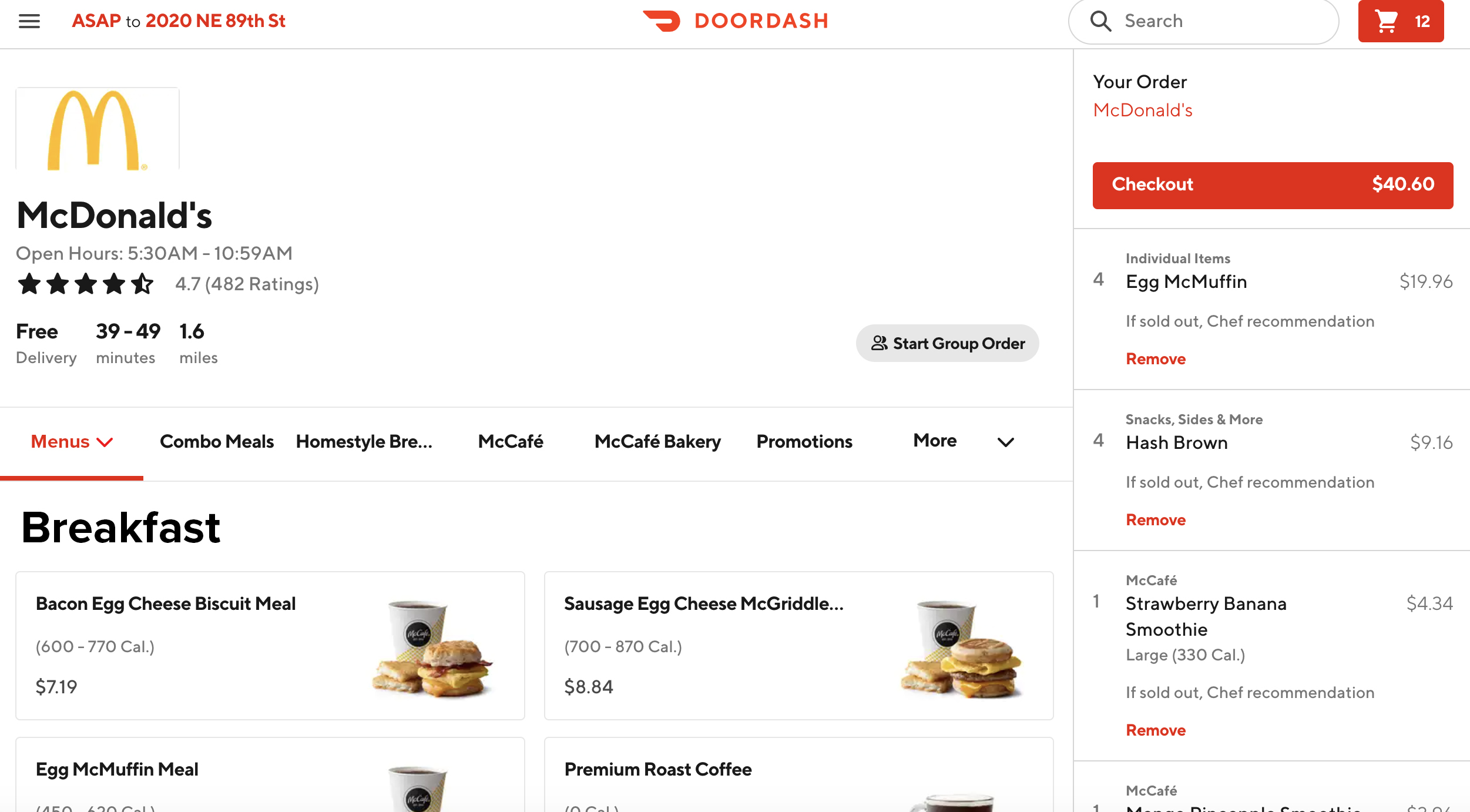
1. How does the user find the appropriate menu they want to order from, e.g., breakfast, lunch, dinner?
In the tasks I prompted the users with, I asked them to order from a menu that was not available at the time they were ordering it – in this case it was McDonald’s breakfast to be delivered at a future date and time. (May 2nd, 9:00 a.m.) Each of the three users scrolled up and down the listing of options on the McDonald’s page for approx. 2-3 mins looking for breakfast items and searching in the secondary navigation only to find that the options were being populated by lunch items. It wasn’t until the 3 - 4 minute mark that each user noticed a button placed above the page’s secondary navigation that reads “menus” with a dropdown arrow and allows the user to select which menu they would like to order from (including breakfast). All of them missed it, which makes me think it’s not visible enough.
How would I fix this?
- I would add the “menus” dropdown tab to the secondary nav as the first button. It’s the first place each of the three users I tested looked and I think it would make sense to consolidate this menu here.
- As an alternative I would prompt the user before they got to this page with which menu they would like to order from so that the page would populate with the items they’re expecting. In this case there would need to be a warning making the customer aware that they could only order breakfast between a specific window of time.
2. How does the user set up an order for a future delivery date?
This task also proved to be confusing to all three users that I tested. The delivery time and date auto-populates with ASAP, which is placed in the upper left hand side of the browser window and does not appear to be a button. Each of the users had difficulty finding this button and expressed frustration and relief when they eventually figured it out.
How could this feature be improved?
- Although I understand the thinking in making the default delivery date and time “ASAP” when considering the purpose of this app (to have food delivered quickly to fill an immediate desire) I think they should add a dropdown arrow to the button ASAP to make the user more aware that this is a button that has a dropdown feature which is not currently apparent. I also think it would be more clear if they added the phrase “time of delivery” before “ASAP” to give it context.
- They could also prompt the user to pick between ASAP delivery and future delivery on the landing page so there would be less confusion moving forward for people who are looking to schedule an order for a later date.


Conclusion
Ultimately I think this site has good usability. It’s clean and organized and I feel like I’m able to complete the tasks I want to without too much confusion. That being said I believe doordash.com should add updates to make it easier to order food in advance or for a later date. The assumption that their customers want food “ASAP” is probably the right one, but that doesn’t mean that they should neglect the usability of their site for customers who are using less popular features. They obviously added the “set delivery date” feature to the site to fill a specific need, why would they make it difficult to use?